A visual style for your content: colour, light and mood
How to build a visual style for your content: a private mood board, light, colour, framing and props, with simple checks that keep your privacy intact.
Part of the guide: Online persona and image: a gentle guide to choosing yours
By the SOMAS Management editorial team 4 min read
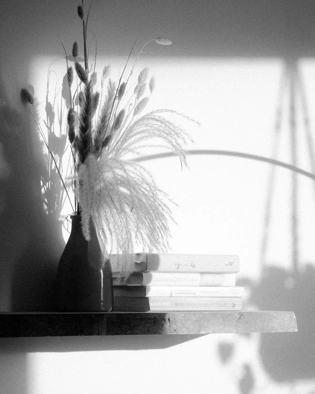
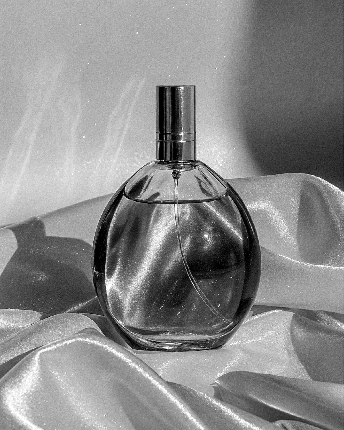
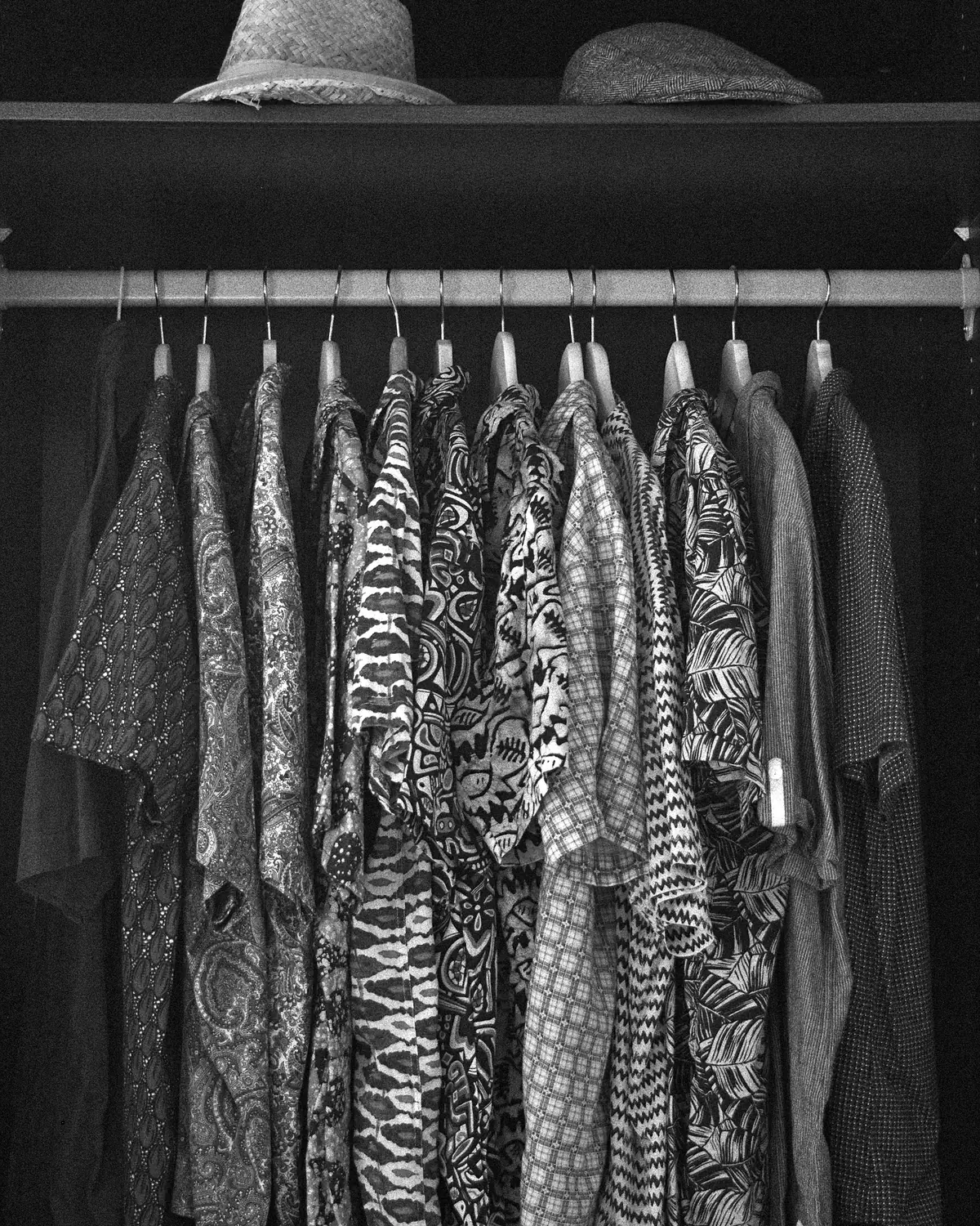
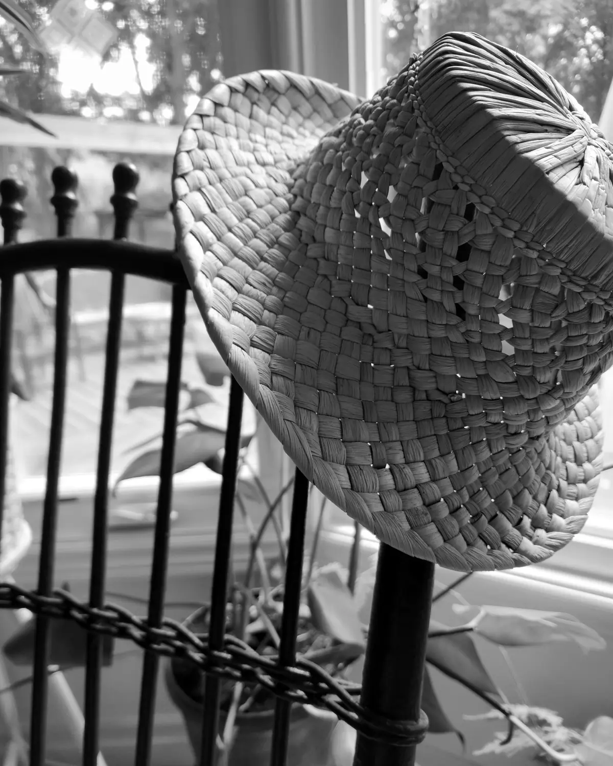
A visual style is what makes your content recognisable before anyone reads a word: a certain light, a few colours, a way of framing, a handful of objects that return. For faceless work it matters even more, because there is no face to carry the identity. The good news is that style is mostly a series of small, repeatable choices, and none of them requires expensive equipment. This guide explains how to find your style, which four ingredients to settle, how to keep it consistent and which checks protect your privacy along the way.
Start with a private mood board
A mood board is a private collection of images, colours and textures that you like. It is a way to find out what you are drawn to, not a set of pictures to copy.
- Save images that appeal to you, from any field: painting, film, interiors, fashion, nature.
- Do not copy another creator’s work. Take the feeling, not the picture.
- After a week, look for patterns. Which colours come back? Is the light soft or sharp? Are the spaces empty or full?
- Keep the board somewhere private, away from your personal accounts.
Three or four patterns are enough to start. They become the first lines of your style.
Four ingredients to settle
- Colour
- A small palette of two or three colours, plus black, white and a neutral. A narrow palette looks deliberate.
- Light
- The quality of light you prefer: soft or sharp, warm or cool, bright or low. Light does more for mood than any prop.
- Framing
- What the frame shows and what it leaves out: close details, silhouettes, off centre compositions or a plain background.
- Props and setting
- A few objects and a neutral space that return from one shoot to the next.
Light first
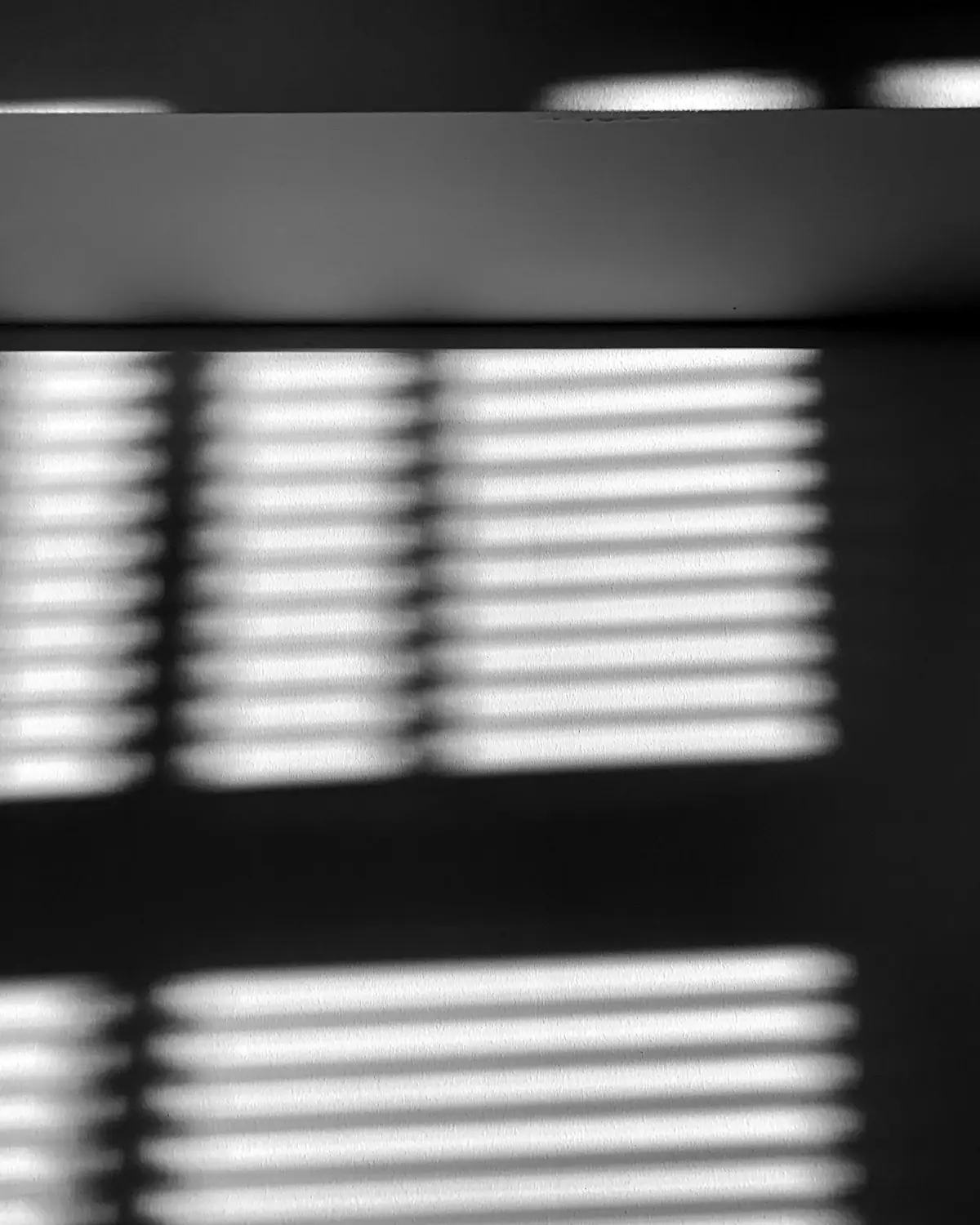
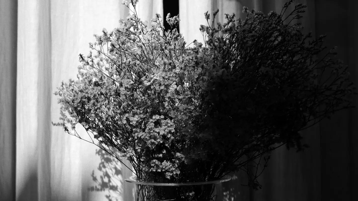
If you change only one thing, change the light. A window with a thin curtain gives soft, flattering daylight. A lamp with a warm bulb gives an intimate mood in the evening. Low light can hide what you prefer to keep private, and a plain sheet can soften a lamp that is too harsh. A phone stand keeps the camera steady, and a few test shots will teach you more than any rule.
Framing for faceless work
Framing is how you keep your identity out of the picture while still giving the image presence.
- Crop on purpose, so that the cut looks like a decision and not an accident.
- Use silhouettes, shadows and partial views to suggest rather than show.
- Keep the same proportions across a series, so your page feels coherent.
- Leave space around the subject. Empty space gives an image calm.
Faceless basics covers the wider routine for keeping your identity out of the frame.
Setting and props
Choose a neutral backdrop, such as a plain wall, a sheet or a corner of a room that you have cleared. Pick two or three props that fit your mood and let them return. Remove everything personal from view: letters, framed photos, recognisable furniture and anything that points to a place. What a photo gives away lists the clues that people forget, from window views to reflections.
Keep it consistent
Consistency is what turns separate images into a style. Write a short style sheet and keep it private: your colours, your light, your framing rules, your props and the way you caption. When you are unsure, return to it. Creating a persona you can keep up shows how the style sheet fits alongside the voice and the limits of your persona.
Check every image before it leaves your device
A quick routine before anything goes online
- Nothing in the background points to where I live.
- Reflections in windows, mirrors and screens show nothing personal.
- Hidden file data has been removed.
- My watermark is in place, if I use one.
- The file name does not contain my name, my town or a date I use elsewhere.
What hidden file data reveals explains the data stored inside a picture, and watermarks and anonymity covers marking your images without exposing yourself.
Let the style evolve
A style is not fixed. Your taste will shift, and your first choices may feel too heavy or too light after a few months. Change one ingredient at a time, so that your page evolves instead of jumping. Keep what works and let go of what you no longer enjoy. If being on camera feels hard, feeling shy on camera describes gentle ways to build confidence.
Questions and answers
Do I need expensive equipment?
No. A phone, a window and a plain backdrop are enough to begin with. Better equipment can help later, but a clear idea and a steady hand matter more.
How many colours should I use?
Two or three, plus neutrals, is a good starting point. A small palette makes your content feel intentional, and it is easier to keep consistent.
Can I use filters or presets?
Yes, if you apply them consistently. Check that editing does not leave hidden data in the file, and do not use effects that make your image resemble someone else’s work too closely.
What if I want to change my style?
Do it gradually and tell your audience if you want them to follow. Keep your privacy habits the same, because they should not change when the look does.
General wellbeing information, not medical advice. If something worries you, speak to a health professional.
Keep reading